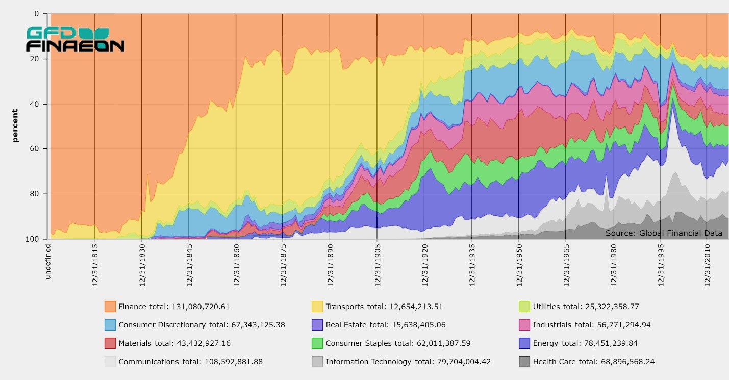
Global Financial Data has revised its sector and industry classification system and has added comparison with the GICS and SIC classification system to help users understand the differences between the three systems.

Global Financial Data has collected extensive data on stocks from the United States and the United Kingdom covering over 400 years. With this, GFD plans to generate indices that cover the history of the stock market from the incorporation of the Dutch East India Company in 1602 to the current market in 2018. GFD will provide a general index, sector indices and size indices.
One question which the creation of size indices creates is how many components should be in the large cap, midcap and small cap indices. Where should large cap, midcap and small cap begin and end? Currently, each index company treats large cap, midcap and small cap indices differently. Let’s look at how different index companies treat market capitalization.
Large Cap, Midcap, Small Cap
Standard and Poor’s has three size indices for the United States with 500 shares in the large cap index, 400 in the midcap and 600 in the small cap. The 500-share index was introduced in 1957 and was meant to represent all of the actively-traded stocks on the New York Stock Exchange. Stocks on the American Stocks Exchange were mostly excluded. As the American market grew and shares began trading actively on NASDAQ, S&P saw a need for a new index. The 400-share Midcap was introduced in 1981, and the Small Cap Index was introduced in 1994. The proper weights for the three size indices was not calculated when the indices were introduced, so the S&P 500 Composite represents a disproportionate amount of the total market capitalization as is illustrated below.
| Index | Market Cap | Percent |
|---|---|---|
| Dow Jones Industrials | 7,105,746 | 23.82 |
| S&P 500 | 26,517,561 | 88.89 |
| S&P MidCap 400 | 1,935,311 | 6.49 |
| S&P SmallCap 600 | 939,132 | 3.15 |
| S&P SuperComposite 1,500 | 29,384,488 | 98.50 |
| US Total Market Cap | 29,832,836 |
The idea for a small cap index was introduced by Russell in 1987 and the data was extended back to 1978. Russell has 1000 stocks in their large cap index and 2000 in their small cap index. However, this creates an even greater imblance for the large cap stocks since the Russell 1000 represents about 92% of the total market cap in the United States and the Russell 2000 represents about 8%. Realizing that this allocation creates such a large imbalance Russell now calculates an index for the top 50 (39% of the market cap of the 3000), the top 200 (65% of the market cap) bottom 2500 (19% of the marke cap), and so forth.
Morningstar and MSCI have more balanced approaches to the size categories. Morningstar refers to the top 70% of stocks as large cap stocks, the next 20% as midcaps and the bottom 10% as small caps. MSCI divides the US stock market into 300 Large Cap stocks, 450 Midcap Stocks, 1750 Small Cap Stocks and the remaining stocks (around 1000) as Micro-cap stocks. By our calculations, this would give about 70% to the Large Cap 300, 16% to the Midcap 450, 13% to the Small Cap 1750 and 1% to the Micro-Cap 1000.
By contrast, the FTSE UK indices have 100 stocks in the Large cap Index, 250 stocks in the Midcap and the next 370 stocks in the Small Cap. By our calculations this gives about 79% of total stock market cap to the FTSE-100, 16% to the FTSE-250 and 5% to the remaining stocks.
Of all of these allocations, the Morningstar approach of 70% Large Cap, 20% Midcap and 10% Small Cap seems the most logical, but how do you put it into practice?
Taylor’s Golden Rule
When the S&P 500 was introduced in 1957, the 500 stocks represented over 90% of the stocks listed on the New York Stock Exchange, but by 2000 there were over 5000 stocks listed on the NYSE, AMEX and NASDAQ. In 2018 the number of stocks listed on the NYSE and NASDAQ had shrunk to around 3500. At the present rate of decline, in a few years there may not even be 3000 stocks to make up the Russell 3000.
The problem with creating long-term indices is that the number of stocks that listed on the exchanges and over-the-counter grew dramatically over time and the number of stocks in the large cap, midcap and small cap groups vary accordingly. During most of the 1800s, there weren’t even 500 stocks listed on all of the exchanges in the United States. So how do you determine how to allocate stocks to the large cap, midcap and small cap categories if the number of stocks in existence is constantly changing?
The best solution is to determine a ratio of the number of stocks in each category. Our research has shown that a golden rule possibly exists for the different groups by size. Our rule is the 10-20-30-40 rule. The top 10% of the stocks by number are Blue Chips, the next 20% are large caps, the next 30% are midcaps and the bottom 40% are small caps. A stock index that included 1000 stocks would include 100 Blue Chips, 200 Large Caps, 300 Midcaps and 400 Small Cap Stocks. The Blue Chips and Large Caps can be combined to create a single Large Cap group.
Allocations of the Sectors
To test our theory we calculated the market caps that would result from this combination for historical indices for the United States and the United Kingdom. For the United States, we chose 1000 stocks from 1894 to 2016, 500 stocks from 1875 to 1893 and 200 stocks from 1830 to 1874. For the United Kingdom we chose 250 stocks from 1864 to 1985.
After we summed the market cap for each group, we divided the market cap of each group by the market cap of all the stocks in the population to determine what the ratios of the different groups were. The results of our analysis are provided below. What is interesting is how closely the percentages for the Large cap, Midcap and Small cap compare over the 300 years of data that is used from the United States and the United Kingdom.
| United States | United Kingdom | ||||
|---|---|---|---|---|---|
| Average | St.Dev | Average | St.Dev | ||
| Blue Chips | 55.27 | 13.15 | 60.39 | 10.49 | |
| Large Cap | 22.67 | 5.29 | 18.85 | 5.01 | |
| BC + LC | 77.94 | 8.25 | 79.24 | 5.64 | |
| Mid Cap | 13.73 | 4.72 | 12.48 | 3.34 | |
| Small Cap | 8.35 | 3.57 | 8.28 | 2.35 | |
| PC of Total | 93.85 | 3.47 | 94.33 | 13.44 | |
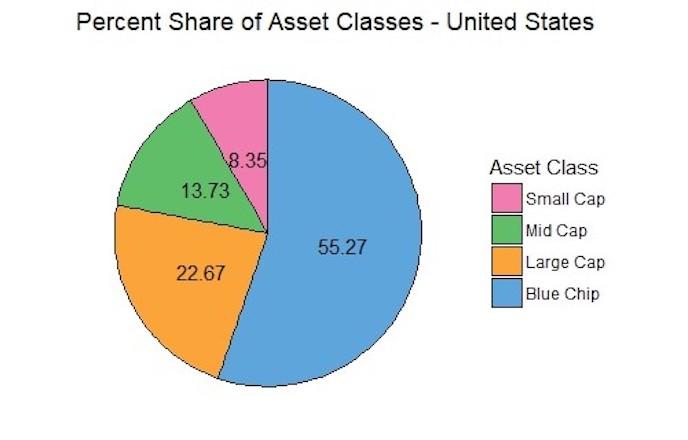
The result is five size indices which can provide useful information to investors. The Blue Chip stocks provide about 60% of the total market cap, the Large Caps 20%, the Midcaps 12% and the Small Caps 8%. As the number of stocks changes over time, or the number of stocks varies from one exchange to the other, these ratios can be used to create useful indices that provide contrasting behavior between the different size indices.
GFD’s size indices will be based upon Taylor’s Golden Rule, and we recommend that other index creators begin using this rule as well.

 On September 1, 2017 two of the giants of the chemical industry, Dow Chemical Corp. and E.I. du Pont de Nemours & Co. merged to form DowDuPont Inc. The new corporation is a holding company with divisions in agriculture, materials science and specialty products.
Both companies had been around for over 100 years before the merger occurred. E. I. du Pont de Nemours Powder Co. was founded in 1802 to manufacture explosives, and incorporated in New Jersey on May 19, 1903. E.I. du Pont de Nemours Co. incorporated in Delaware on September 4, 1915, succeeding E.I. du Pont de Nemours Powder Co. Dow Chemical Co. incorporated in Michigan on May 18, 1897. Although it is considered a “merger of equals”, Dow Chemical has become DowDuPont while E.I. du Pont de Nemours ceases to exist.
On September 1, 2017 two of the giants of the chemical industry, Dow Chemical Corp. and E.I. du Pont de Nemours & Co. merged to form DowDuPont Inc. The new corporation is a holding company with divisions in agriculture, materials science and specialty products.
Both companies had been around for over 100 years before the merger occurred. E. I. du Pont de Nemours Powder Co. was founded in 1802 to manufacture explosives, and incorporated in New Jersey on May 19, 1903. E.I. du Pont de Nemours Co. incorporated in Delaware on September 4, 1915, succeeding E.I. du Pont de Nemours Powder Co. Dow Chemical Co. incorporated in Michigan on May 18, 1897. Although it is considered a “merger of equals”, Dow Chemical has become DowDuPont while E.I. du Pont de Nemours ceases to exist.
As you can see, du Pont was the better performer from 1917 to 1932. The companies performed about the same between 1932 and 1966, but over the past 50 years, Dow Chemical has been the better performer, though considering the fact that this chart covers 100 years, their long-term performance has been remarkably similar.
Investors in DowDuPont in 2017 can only hope that the new company continues to outperform the stock market over the next 100 years.

 When Standard and Poor’s introduced the S&P 500 index in March 1957, it revolutionized the index world and created a benchmark for the stock market that is still used today. The original S&P 500 index included 425 industrial stocks, 15 rail stocks and 60 utility stocks. The S&P 500 maintained this composition until July 1976 when finance stocks were added to the index. The index included 400 industrials, 40 utilities, 40 finance and 20 transport stocks in 1976. Allocation by sector was abandoned on April 6, 1988 and today S&P uses their GICS sectors with no attempt to allocate stocks by sector.
When the S&P 90 Stock Index was introduced in 1928, it was the broadest cap-weighted daily index that was calculated in the United States and included 50 industrial stocks, 20 rail stocks and 20 utility stocks. Between 1928 and 1957, the number of industrial stocks grew dramatically. When Lew Schellbach introduced the S&P 500 on February 27, 1957, almost all of the expansion went to the industrial sector. The number of industrial stocks increased from 50 to 425 while the number of railroad and utility stocks hardly changed.
Advances in electronic calculation between 1928 and 1957 enabled Melpar Inc. to calculate a daily index of 500 stocks which could also be calculated on an hourly basis. More stocks could have been included in the index, but the other stocks were traded thinly or lacked sufficient public interest to be tracked on a daily or hourly basis. The 500 stocks that were put into the S&P 500 covered 90% of the stock market’s capitalization, and returns on the S&P 500 would differ little from a total market index that could have been calculated.
To provide some historical perspective, the data for the S&P Composite was extended before 1957 in two ways. First, daily data from the S&P 90 Index was used to provide a daily history back to 1928. Second, the Cowles Commission had calculated a composite extending back to 1871. Weekly data from Standard Statistics was used from 1918 to 1927 and the Cowles Commission data was used from 1871 to 1917.
What few people realize is that the composite index that Standard Statistics started calculating in 1918 was still being calculated in 1957 and the index included 480 stocks consisting of 420 industrials, 20 railroads and 40 utilities in 1957. So the new S&P 500 was little different from the existing S&P Composite. The difference was that in 1956, the broader S&P Composite was only calculated once a week on Wednesday, not daily. The S&P 90 was used to extend the S&P 500 back to 1928 because it was calculated on a daily basis, not because it was the broader index.
The existence of two Composite indices between 1928 and 1957 allows us to compare the performance of the two composites. Basically, the S&P 90 was a large cap index that included the 50 largest industrial stocks while the Composite included 350 industrials in the 1940s (402 stocks in total) and 420 industrials in the 1950s.
The chart below compares the performance of the two indices between 1928 and 1957. The data for the S&P 90 is included in the S&P Composite from 1928 to 1957 and the data for the broader composite is represented by the green line.
When Standard and Poor’s introduced the S&P 500 index in March 1957, it revolutionized the index world and created a benchmark for the stock market that is still used today. The original S&P 500 index included 425 industrial stocks, 15 rail stocks and 60 utility stocks. The S&P 500 maintained this composition until July 1976 when finance stocks were added to the index. The index included 400 industrials, 40 utilities, 40 finance and 20 transport stocks in 1976. Allocation by sector was abandoned on April 6, 1988 and today S&P uses their GICS sectors with no attempt to allocate stocks by sector.
When the S&P 90 Stock Index was introduced in 1928, it was the broadest cap-weighted daily index that was calculated in the United States and included 50 industrial stocks, 20 rail stocks and 20 utility stocks. Between 1928 and 1957, the number of industrial stocks grew dramatically. When Lew Schellbach introduced the S&P 500 on February 27, 1957, almost all of the expansion went to the industrial sector. The number of industrial stocks increased from 50 to 425 while the number of railroad and utility stocks hardly changed.
Advances in electronic calculation between 1928 and 1957 enabled Melpar Inc. to calculate a daily index of 500 stocks which could also be calculated on an hourly basis. More stocks could have been included in the index, but the other stocks were traded thinly or lacked sufficient public interest to be tracked on a daily or hourly basis. The 500 stocks that were put into the S&P 500 covered 90% of the stock market’s capitalization, and returns on the S&P 500 would differ little from a total market index that could have been calculated.
To provide some historical perspective, the data for the S&P Composite was extended before 1957 in two ways. First, daily data from the S&P 90 Index was used to provide a daily history back to 1928. Second, the Cowles Commission had calculated a composite extending back to 1871. Weekly data from Standard Statistics was used from 1918 to 1927 and the Cowles Commission data was used from 1871 to 1917.
What few people realize is that the composite index that Standard Statistics started calculating in 1918 was still being calculated in 1957 and the index included 480 stocks consisting of 420 industrials, 20 railroads and 40 utilities in 1957. So the new S&P 500 was little different from the existing S&P Composite. The difference was that in 1956, the broader S&P Composite was only calculated once a week on Wednesday, not daily. The S&P 90 was used to extend the S&P 500 back to 1928 because it was calculated on a daily basis, not because it was the broader index.
The existence of two Composite indices between 1928 and 1957 allows us to compare the performance of the two composites. Basically, the S&P 90 was a large cap index that included the 50 largest industrial stocks while the Composite included 350 industrials in the 1940s (402 stocks in total) and 420 industrials in the 1950s.
The chart below compares the performance of the two indices between 1928 and 1957. The data for the S&P 90 is included in the S&P Composite from 1928 to 1957 and the data for the broader composite is represented by the green line.